Client
Artist Arcade, Disney
Deliverables
- Game Design
- Multiplatform UX/UI Design
- User Research
- Design System
- Email Design
Overview
Disney SpellStruck reimagines the traditional word puzzle as a vibrant adventure through the Disney universe, where players engage with beloved characters and delightful surprises. By leveraging Apple’s accessibility and design principles, the game was crafted to provide an inclusive, engaging experience for players of all ages. The result was a playful and scalable UX/UI design that seamlessly balanced Disney’s iconic charm with cross-platform usability, culminating in a global hit that topped charts.
The Origin Story
Disney Spellstruck was a collaboration between Artist Arcade and David Bettner, co-creator of Words with Friends, featuring a crew of most beloved Disney characters. We worked in direct partnership with Disney, and support from Apple Arcade, so the bar was high. This game was a group effort from a small team spread out across the globe and required meticulous planning and creative problem-solving—resulting in a dynamic, fun and much-loved product that topped charts and was prominently featured at WWDC as well as Disney's 100th anniversary campaign.
Words And Wonder
Putting a twist on a classic is one thing; doing that while making a game that's fun, clever and unexpected is a different beast. Doing all of that, plus using beloved characters and bringing a Disney-worthy experience... well, that presented some challenges:
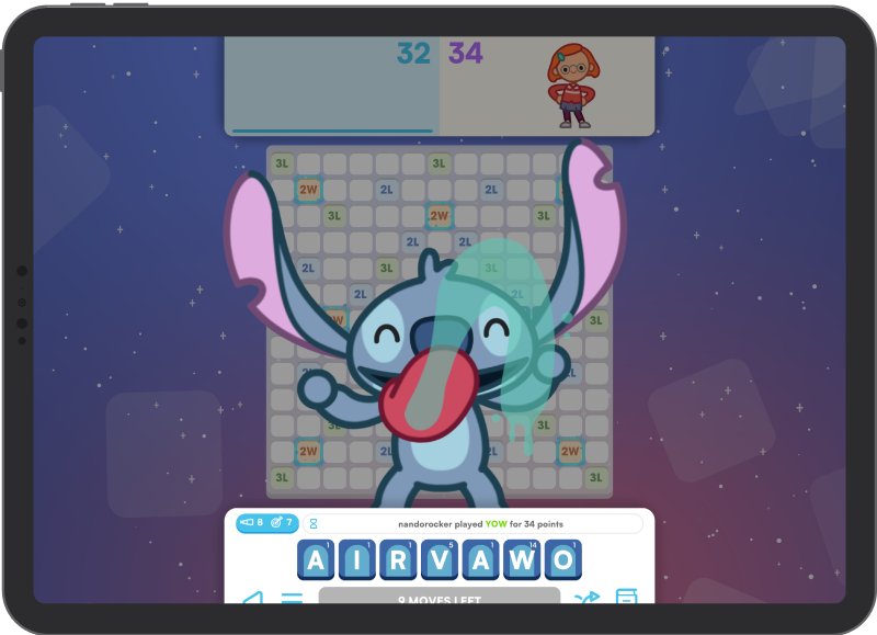
- Multi-Platform Support: Ensuring seamless gameplay across phones, tablets and TVs—through touch, keyboard + mouse, and gamepads.
- The Disney Experience: Creating a magical, engaging experience that honored Disney’s iconic characters.
- Apple Arcade’s Rules of Play: Adhering to family-friendly guidelines, with no in-app purchases, and delivering a polished, cohesive game experience.
- Localization for a Global Audience: Ensuring the game’s word puzzles and UI were accurately translated into multiple languages while maintaining cultural relevance.
- Iterative Content Design: Building systems that allowed frequent additions of Disney characters and features without disrupting existing gameplay mechanics.
The Approach
What I Mean By "UI/UX"
In games, the term UI/UX is often understood as "Visual Design." To me, it's part UI designer, part game designer and part psychologist: I'm here to serve the game experience created by the team, as well as the player, through my knowledge of usability and psychology.
In SpellStruck, my team's work comprised of several aspects:
- Creating User Flows: understanding the rhythm of the game, as well as the order of screens, messages were crucial to encourage gameplay, make things intuitive and keep players coming back
- Planning & designing screens and overlays: the layout of areas such as the home screen, as well as in-game overlays, sidebars, popups and messaging
- Setting Controls: developing a control system that scaled to all Apple Arcade supported devices
- Gameplay elements: the core elements used to play the game, as well as the messaging (verbal & non-verbal) provided by those elements, for example, whether a move is allowed or not, correct or not, or the impact of events like power-ups.
As lead UX, I also created a process and workflow for the UX team that accounted for exploration/trial and error, as well as production and handoff standards.
Iterative Prototyping
We tested frequently across devices. Rapid feedback cycles (both internal AND external) allowed us to hone interactions and address player needs before finalizing features.
Teamwork
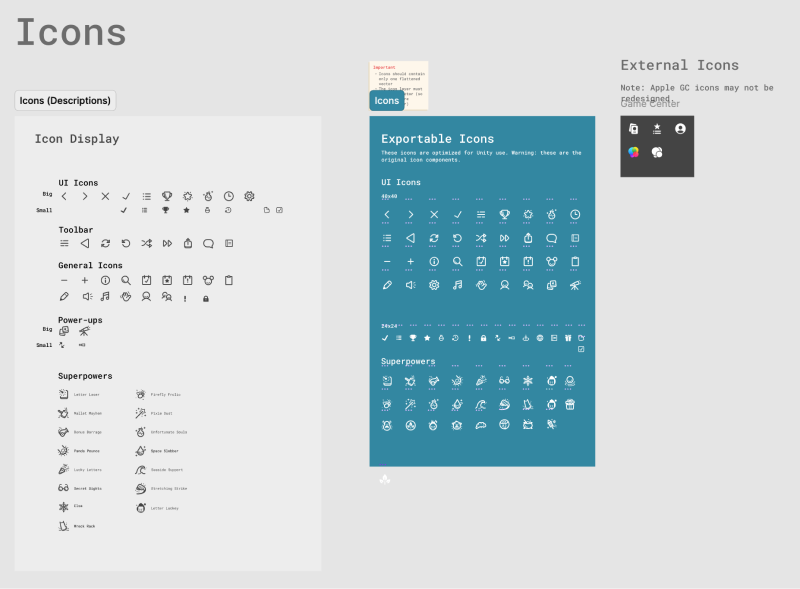
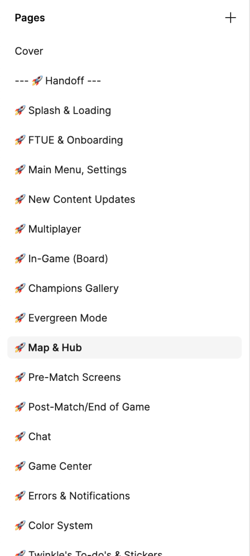
Collaboration was at the heart of this project. Our team worked closely with Disney to ensure their iconic characters were faithfully represented. I created file and folder structures and patterns that enabled better communication, as well as continuous implementations after I was no longer in the team.
Usability and Accessibility
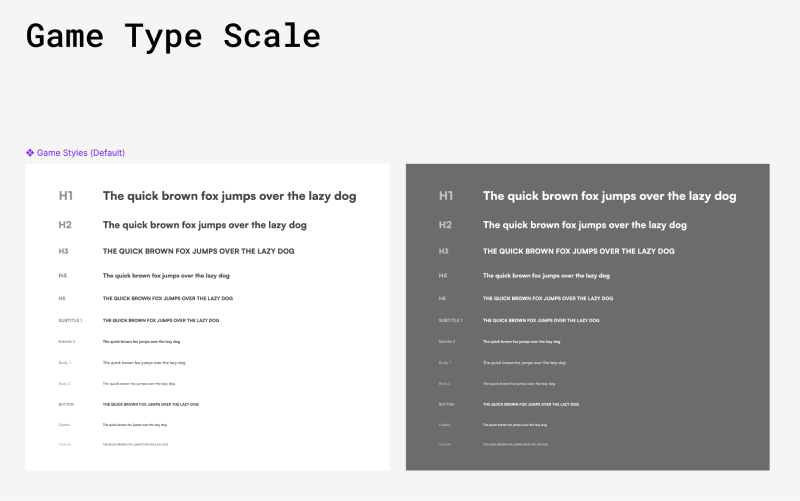
We followed the Apple Human Interface guidelines closely, prioritizing usability and accessibility in every control and information design decision.


The Process
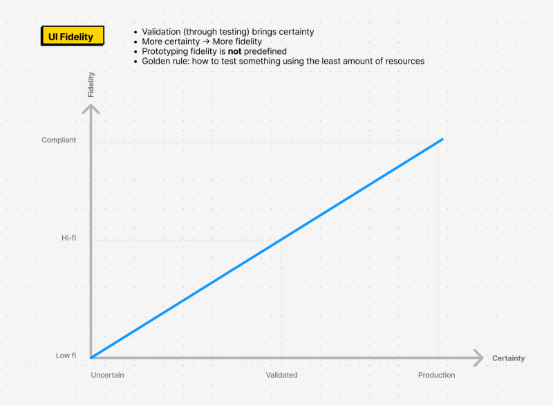
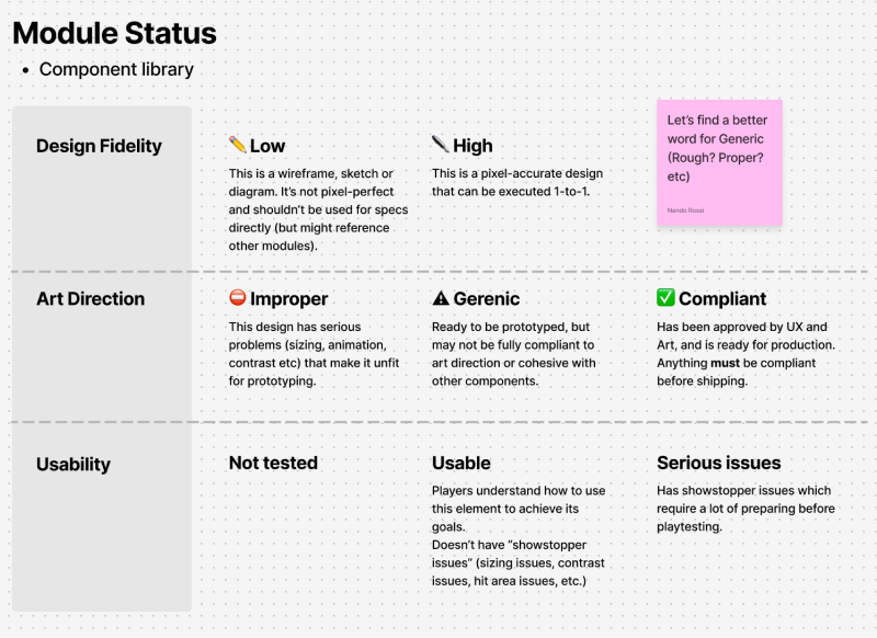
Regardless of project, I always start with some standard practices: wireframing the player journey, and developing a simple and modular design system. The process is validate, test, iterate: start with well-known patterns, validate and then ask yourself: is this fun?

The Tiles
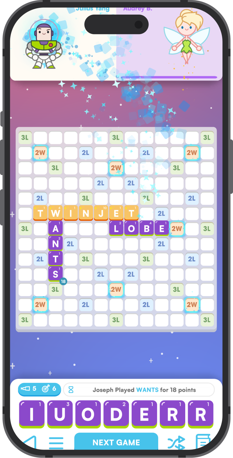
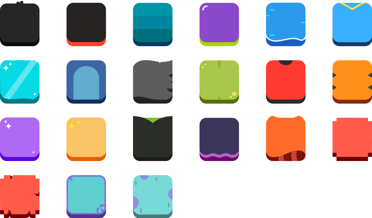
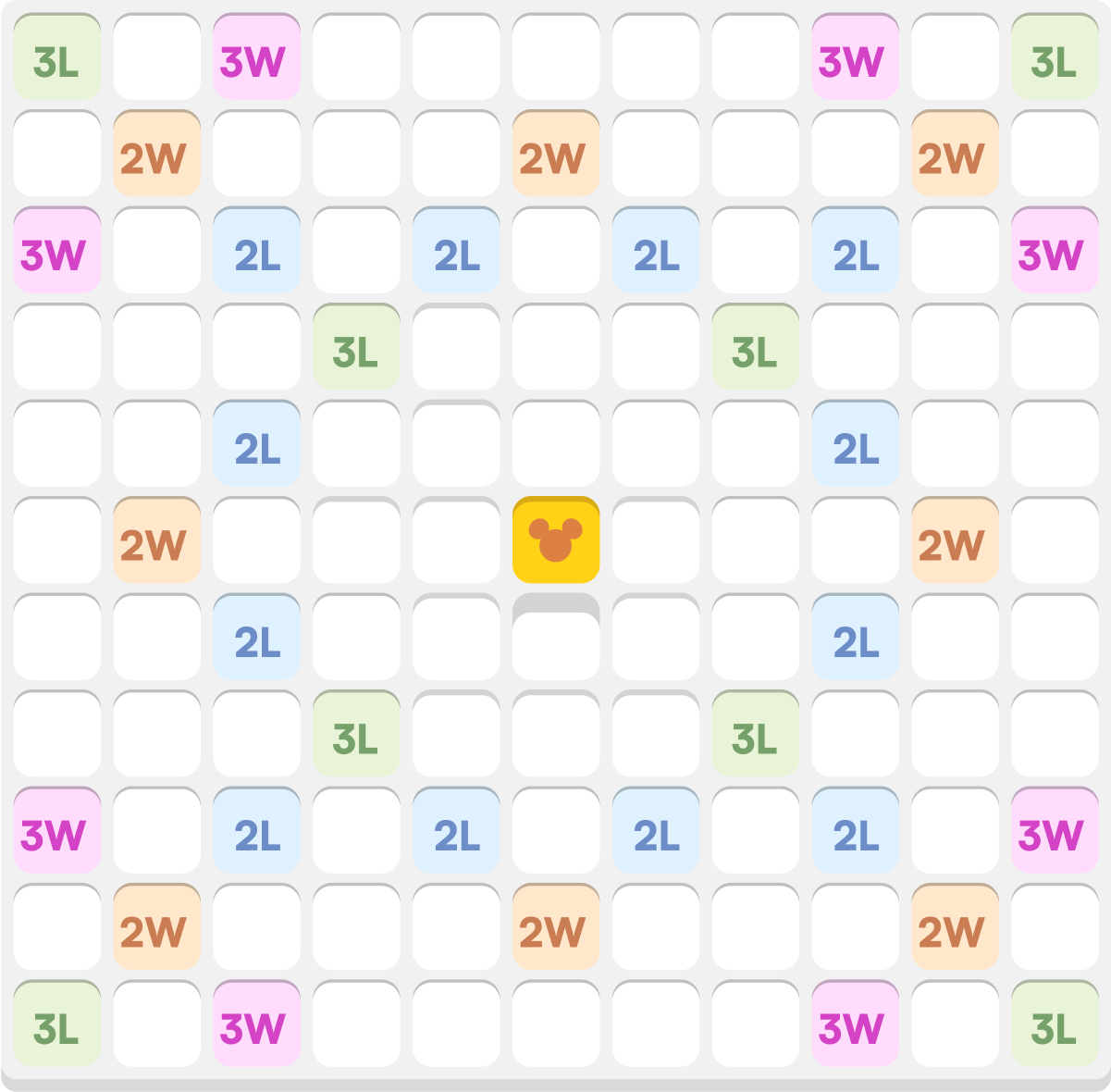
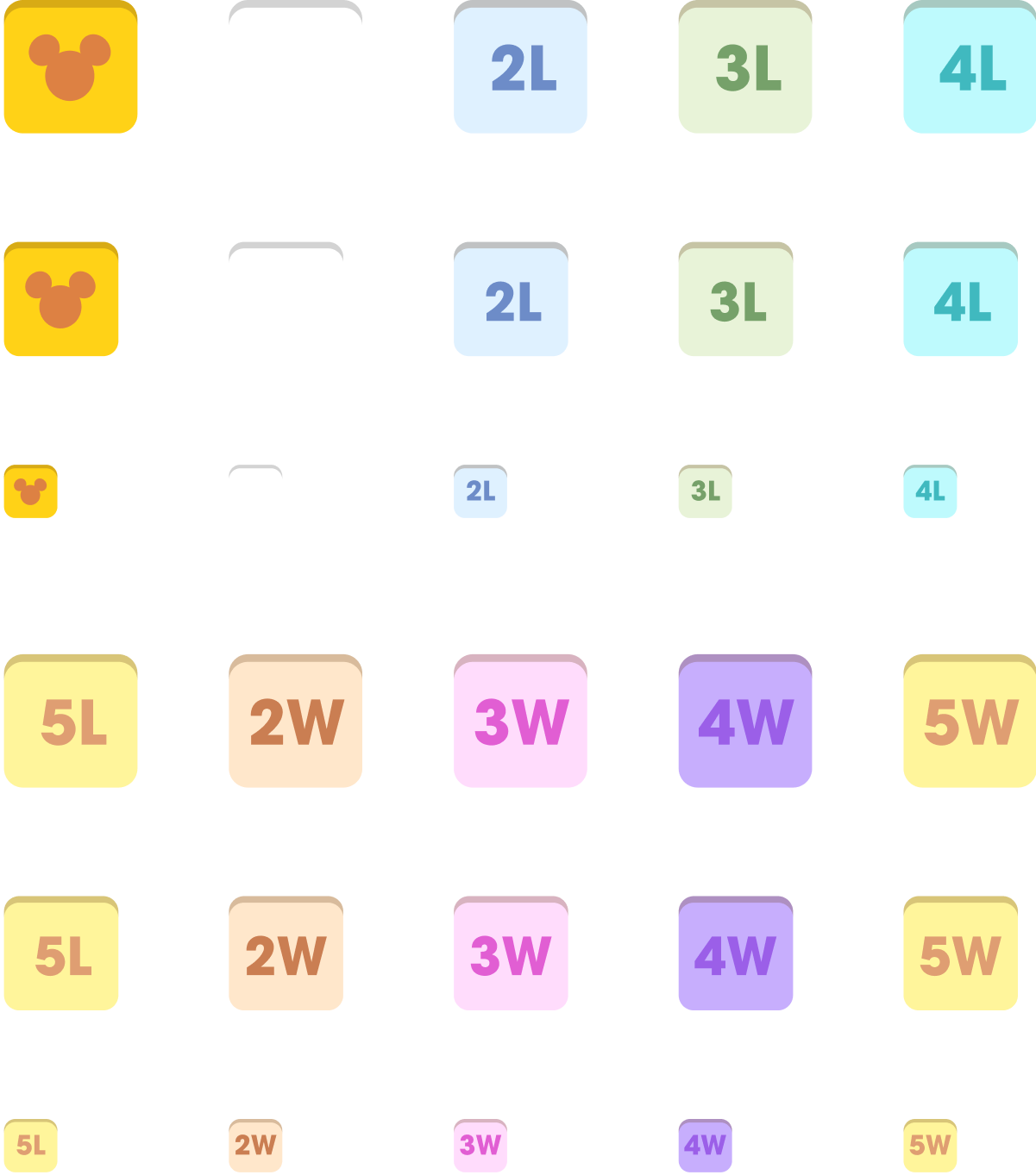
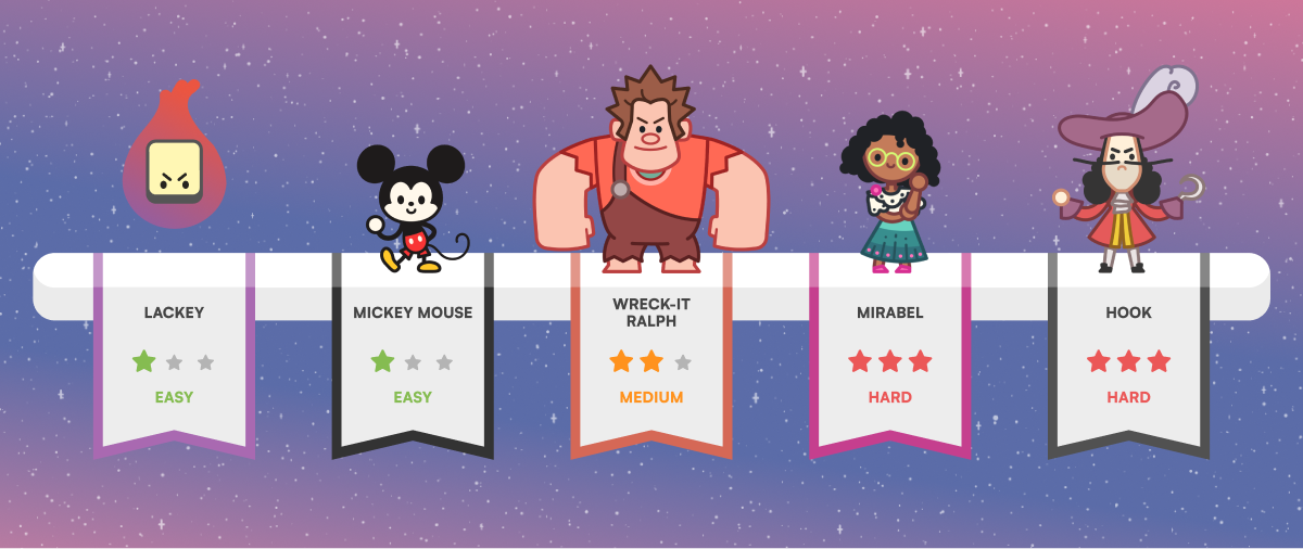
The tile system is the core part of the gameplay. In normal Scrabble, all tiles look about the same. In our game, tiles were all individually designed to represent the characters. The Scrabble board is usually quite simple as well, with only different colors for different point values (double word, triple letter, etc), whereas in our case, we also had powerups and the gamepad cursor.
Things got messy pretty quick, so it was my responsibility to come up with a system. After much iteration, the result was a combination of colors, outlines as well as VFX.
But visuals were only one layer. While controlling the touch version was simple, gamepad was a concern. Nobody likes to type on a gamepad, fishing for letters one by one—yet this game is basically that. We needed to try things. Through very focused work sessions with Ferran, we used simple graphics and prototypes to answer the question: which controls are fastest and flow best?
Some of our challenges:
- How to easily switch between board and tile rack?
- How to clearly visualize the cursor, among with all the other tile states?
- How to quickly manipulate letters in the rack (or shuffle them)
- How to correct mistakes
Each of these problems was addressed in a "barebones" way, not too concerned about creative direction at first and thoroughly tested. Some of what we tried:
- Establish one button as "back", another "action"
- Use a color system exclusive to cursors, outside the art direction (akin to TV outlines)
- Create a "picked up" state for tiles that make them exaggeratedly big
- Cancel words with a simple button click
- and many others.
Some of these immediately worked. Others took iterations, but we ultimately found the best combination that is in the game today.
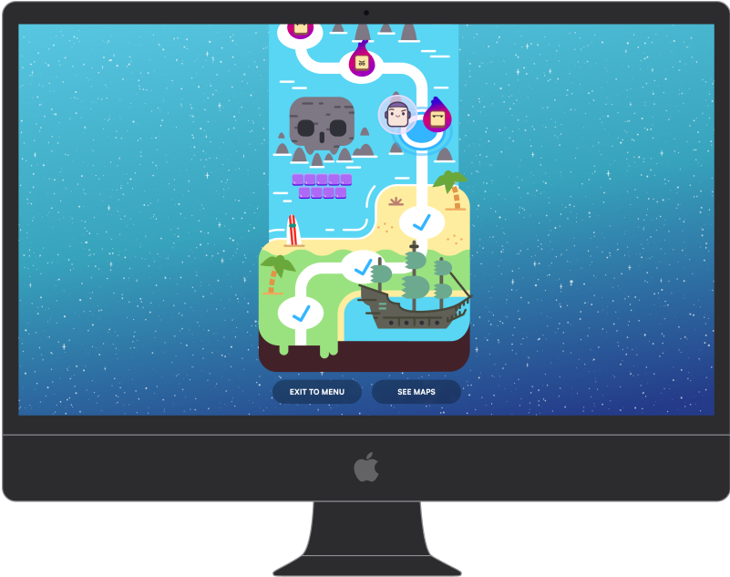
Creating The World Map
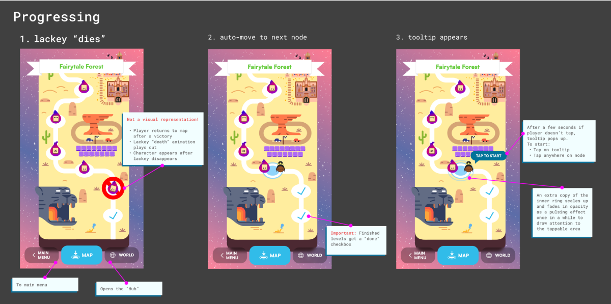
Another challenge was the game map. Initially, we focused on making sure players could intuitively see their progress, access different levels, and understand what lay ahead. The initial challenges were not simple:
- Does the player understand the relationship between maps (i.e., the "world")
- Does the player know how many levels there are in this map?
- Can the player understand their progress?
- Can the player navigate without difficulty, on all input devices?
From the start, we used rich graphics, but the interactive parts (paths, levels points, states) as well as transitions took many tries. There were many discussions and iterations about the active state, confirmation popups, transition between maps and what our two buttons did, as well as the touch/mouse equivalents.
Considering the limitations, we have a robust and fairly usable implementation, where the core interactions are straightforward.
The Results
- App Store Charts: Achieved #1 on the App Store for weeks, remaining in the Top 20 for several months.
- Celebrated Worldwide: Featured by Apple at WWDC and as part of Disney’s 100th Anniversary.
- Lots of love: continue to inspire thriving fan communities, tons of social media posts and YouTube walkthroughs.
- A Lasting Legacy: as part of Disney’s official game canon, SpellStruck continues to entertain audiences of all ages.
What I Learned
Working within a game dev structure means not always having full control of product design. It's important to remain collaborative and contribute your share.
At the same time, lead designers have an opportunity to create the means for better collaboration across disciplines, which always leads to better results. This is a principle I carry out in every project.
Disclaimer: game images and videos © 2023 Disney. © 2023 Disney/Pixar. © 2023 Artist Arcade. The material displayed here is merely for informative purposes.


