Client
TestFlight (Burstly)
Deliverables
- UX/UI Design
- Brand Design
- User Research
- Systems Design
- Email Design
Overview
TestFlight, now part of Apple, began as a project to make beta testing smoother and more accessible for developers and testers alike. With a focus on both problem-solving and character, I led the startup's product design to create a tool that balanced robust functionality with a playful, relatable brand. This case study explores how our unique approach turned TestFlight into an industry favorite—a product that solved real challenges while building a connection with its users, ultimately leading to Apple’s acquisition.
The takeoff
TestFlight was born out of a problem we’d been facing ourselves. In 2011, the App Store was still young, and tools for app testing were painfully limited. Beta testing required multiple, manual steps for each tester, making it nearly impossible to gather meaningful feedback at scale. At 23/, where we developed apps for major clients, these frustrations were part of our daily work. Distributing test versions required multiple manual steps for every tester, making it difficult to gather the valuable feedback we needed. Our founder, Ben Satterfield, saw an opportunity to streamline this process, and our team set out to create a tool that would make beta testing seamless.
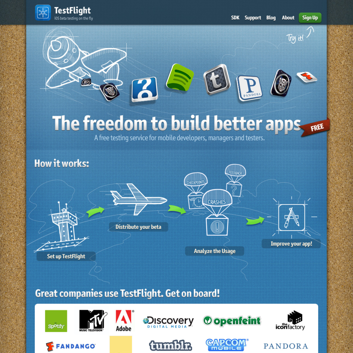
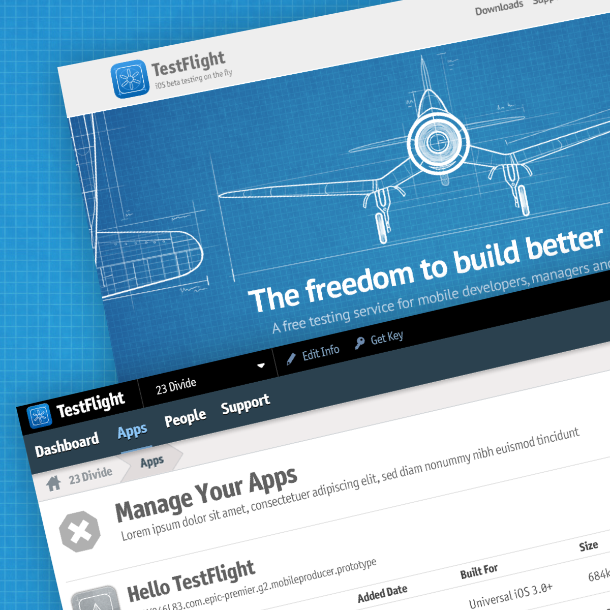
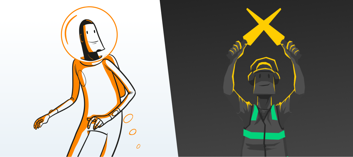
From the start, TestFlight wasn’t just about functionality—it had personality. From the first demo, Ben came up with the name, and designer Neven Mrgan created an initial concept and icon that although simple, sparked my imagination and inspired my direction for iterations to come: the blueprint of a propeller. In the coming months, I worked with creative prodigy and illustrator Vanja Mrgan to expand it, building a cohesive experience around our mascot, TestFlight Guy—an old-timey pilot scattering app icons across a blueprint field.
I embraced this playful, approachable style to create a brand that developers would connect with. While I focused on making the interface intuitive and simplifying the beta distribution process, I was equally committed to making TestFlight feel fresh, reliable, and fun. We weren’t just building a tool; we were creating something developers would proudly display and engage with, evolving TestFlight into much more than we initially envisioned.

The bridge: designing for two user groups
Creating TestFlight meant designing for two very distinct user groups: developers and testers. Developers needed powerful features to manage distribution, while testers needed a seamless, intuitive way to install and try out beta apps, as well as easily leaving feedback. Balancing these requirements within one platform was a significant challenge.
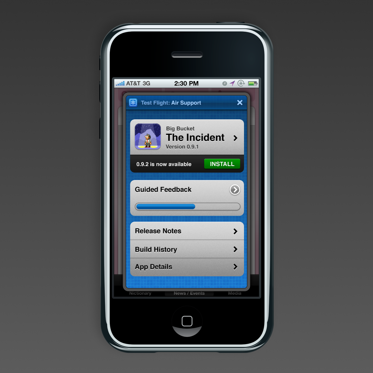
To bridge the gap, I collaborated closely with our developers, both in-house and in our user base, whose daily feedback helped me understand the workflows and data points that mattered most. For example, developers needed detailed crash logs, so we worked through several iterations until the logs displayed essential information without overwhelming the dashboard.
Another challenge was adapting the TestFlight interface to support branching, which allows developers to manage different versions of an app simultaneously. GitHub was still new, and as a non-developer, designing an intuitive visual representation for this complex feature took a lot of discussion and iteration. Though we ultimately pivoted away from this feature, the process taught me the importance of listening to users and shedding my preconceptions before offering solutions.
Beyond beta: expanding into the SkyRocket Suite
As TestFlight grew exponentially over a year or so, our free service had developed a loyal user base who relied on it as a vital tool for their business. Around that time, we were acquired by Burstly, a company focused on monetization in mobile apps. While Burstly was part of our journey from the beginning, the acquisition gave TestFlight the resources to expand into something even bigger—a suite of tools to support developers through every phase of app development.
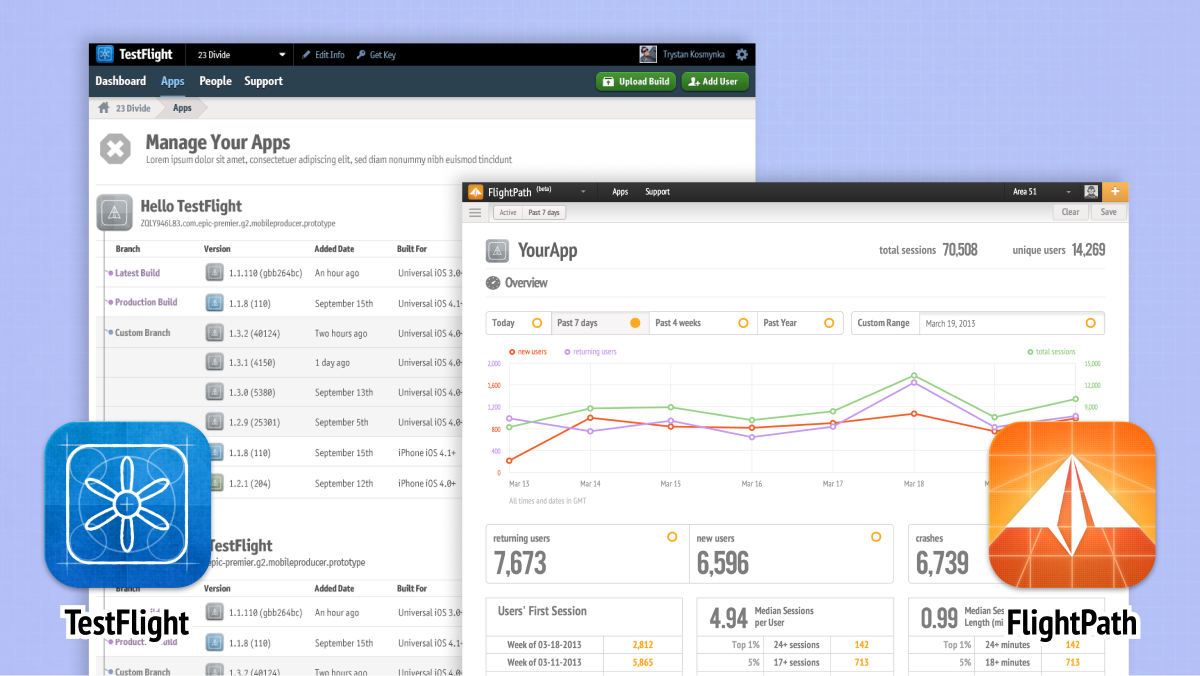
This expansion was a transformative period for me professionally. My role shifted from designing a single product to directing the design of an entire suite, including FlightPath (for analytics) and SkyRocket (for monetization)—not to mention creating branded elements for our new office. Designer Björgvin Friðgeirsson and data specialist Brian Suda were building FlightPath in a sleek, minimal style, with a sharp focus on displaying complex analytics in a clear, actionable way.
I combined the original TestFlight vibe, including Vanja’s characters, with this minimal approach to create a design system (a term that wasn’t widely used at the time) that guided the development of SkyRocket and overhaul of TestFlight. The new branding also included new app icons, designed by Björgvin and me, which stayed true to the product’s roots but evolved to reflect its broader capabilities.
The Impact and Legacy of a beloved tool
Our unique approach to blending utility and personality fueled TestFlight’s rapid growth. At events like WWDC, more and more developers were wearing our T-shirts, placing our stickers on their laptops, and posting praise for the app. These gestures weren’t just marketing; they were a testament to the community we’d built. Developers didn’t just use TestFlight; they loved it and connected with it on a personal level. We got messages daily from devs asking to pay for it, simply to ensure it would stick around
As our user base grew, I continued refining the interface, bringing insights from FlightPath and SkyRocket back to TestFlight to improve navigation, data accessibility, and ease of use. Each new release strengthened the platform and expanded its reach, establishing TestFlight as an industry-standard tool.
Apple’s acquisition of TestFlight in 2014 was the logical (and best possible) conclusion. Seeing Apple adopt TestFlight and retain much of its branding was a powerful validation of the work we had done. While stepping away from the project was bittersweet, I left knowing that we had created something that would endure. The experience taught me that when you design with empathy, bringing both personality and functionality to the table, you create products that resonate deeply with users.

What I learned from TestFlight
- Design with empathy: Understanding the unique needs of both developers and
testers
allowed us to create a tool that felt both powerful and approachable.
- Balance functionality with personality: TestFlight’s playful branding
helped set it apart in a technical field, making the product more memorable and engaging for users.
- Listen and iterate: Collaborating closely with in-house developers and gathering
regular user feedback helped us refine the interface and stay aligned with evolving workflows.
- Build a cohesive design system: Expanding TestFlight into the
SkyRocket suite required a scalable design system that maintained brand consistency while
accommodating
new tools like FlightPath and SkyRocket.
- Create a community around your product: The genuine connection users felt with
TestFlight turned them into advocates, helping the product grow and become an essential part of the
app
development ecosystem.
- Leave a lasting legacy: Building a product that resonated deeply with users
helped
ensure its continued success—even after Apple’s acquisition.
These principles remain central to my approach in creating products that are both impactful and beloved by users.


